SCOTCH PORTER MOBILE.
website design
We were tasked with redesigning the Scotch Porter website experience to better convert potential customers on mobile devices.
With the references provided to us by Scotch Porter, we recognized their wishes increase the amount of information available to customers who land on the homepage. By designing new sections that educate customers, we have more ways to convert them into customers, compared to what was being offered previously.
More Informed Customers
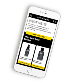
There is a lot of information a customer may want to know before making their first purchase. Instead of asking users to tap around the site and visit new pages, we included much of that information forward to the homepage.This way, users instincts of scrolling on their phone is being rewarded. An expandable sections with more information on individual products in each product line also aided us with this goal, letting users learn more about the different products for sale, without being taken to a product page or suddenly being asked to purchase every product they want to learn about.
Call To Actions
Plenty of buttons and call to action elements may be found on the homepage, so that once a customer has learned what they need to know, they can make a purchase quickly and easily. With our design, we did out best to space these buttons out so that they will be on screen often, while not overloading visitors with an excessive amount at any given time.
Let’s Shop
The product listings help get customers to checkout quickly. Since the homepage allows users to learn a lot about the different products being sold, we made the main call to action on the products listings an add to cart button. Visitors can still learn more about the individual products if they would like.