FRESH MEAT.
branding
packaging
& print
What is Fresh Meat? Let’s start here…
Fresh: Recently made or obtained; not canned, frozen, or otherwise preserved.
Meat: The flesh of an animal (especially a mammal) as food.
Now, let’s adjust and combine these two words to make them both better suit men and grooming.
Fresh: Canned but recently obtained, or otherwise cared for.
Meat: The exterior body parts of a man.
In a nutshell…
We helped with creating a product designed for men to keep their meat packing district fresh and clean anytime, anywhere. Below is a breakdown on how we helped, what we did and a look into the buzz that Fresh Meat has generated in just two weeks.
THE IDENTITY.
The NAME: The WORD on the street is that the Scotch Porter team, with the help of The Artoholiks developed this name within one week. This is a big deal because the Scotch Porter team had less than a month to develop, brand, package and take this product to market. So, first came the name. In a quick huddle up, the SP team determined that the name needed to be edgy, fun, and spark conversation. Unlike other Scotch Porter products, Fresh Meat needed to have a different voice. We knew this product would create uncomfortable conversations between men, because who wants to talk about smelly balls? So in order to break the ice, it would need to be funny. At the end of the day… balls need to be clean and the word balls will always be funny. Two Truths!
THE BRANDING.
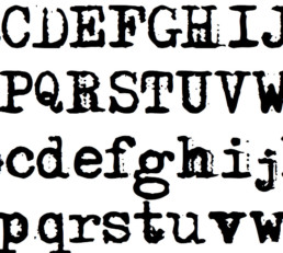
The fun name was followed by the opportunity to have a lot of fun with what this thing would look like. The Artoholiks spent a weekend developing logo and tagline concepts. The minute we landed on the name, we instantly thought, BUTCHER SHOP! The Artoholiks design team decided to execute concepts around the butcher shop, with different font, shape and style options.
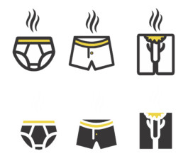
After a week of discussing the sketches, team Scotch Porter and The Artoholiks landed on the core logo, which lead us to building out the rest of the brand elements. From meat packing paper to a suite of icons featuring the Fresh Meat sausage.
THE PACKAGING:
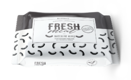
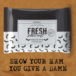
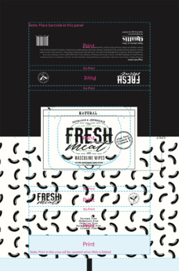
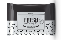
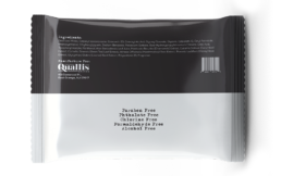
Once all of the elements were approved, we had a strong identity, which was great because we had to quickly focus on how this thing would look and feel on the day it arrives in the customers’ hands. The goal here was to create a small package that men could carry with them daily, but also fit enough wipes that would make his purchase worthwhile. We also thought, how could this package be fun yet masculine. So we decided to roll with a black and white minimalistic approach while allowing the sausage pattern to capture the playfulness of the brand.
To support the launch of this product, we armed the Scotch Porter team with an arsenal of graphics for email blasts, social posts, digital ads, website banners, and print materials. Although this product isn’t a gimmick and truly provides a real solution for all men, the SP team produced a video that would help the product attract a viral buzz; in less than 2 weeks, this video reached 15k views.
Hey bro… Pass me a wipe, this recap got me sweating!
THE END
