SCOTCH PORTER CBD.
design
& packaging
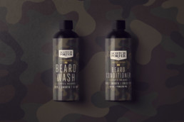
The Scotch Porter CBD collection presented us with a challenge to do something totally different for the brand than what we’ve done in the past. With the Fresh Meat project, the challenge was to create an all new brand under the Quallis Brands umbrella. That project was super exciting as it gave us free range to break all of the brand guideline rules. With this Limited-Edition CBD collection, we had to spend time thinking about how to make it look and feel different while maintaining the aesthetic of the brand product packaging.
WHAT IS CBD?
CBD, short for Cannabidiol, is a chemical compound that is derived from the Hemp plant.
“Our team has curated and incorporated the perfect CBD formulation into our beard care products for those dealing with skin sensitivities like flakiness, dryness and irritation. Our Limited-Edition CBD Beard Collection high in vitamin E, fatty acids and omega-3, omega-6 and omega-9, does wonders by nourishing the skin under the beard and strengthening hair, thereby encouraging beard growth.” – Founder, Calvin Quallis
THE PROCESS
IDEATION.
During our initial meeting with the CEO and Founder of Scotch Porter, Calvin Quallis, we discussed that we would explore the idea of incorporating the theme of nature. Post-meeting, we huddle up and explored colors, identifying which colors represent limited-edition and nature. Then, just like that, viola! We landed on gold, green and black. Following a series of external and internal meetings, we understood that we would not change the existing type treatment. It was very important to both of us to maintain the seasoned Scotch Porter look throughout the special release.
DESIGN.
With agreeing to not change the type treatment and solidifying colors, we still wanted to take this opportunity to make the packaging different and special. The design team quickly explored printing possibilities and after a few conversations with the Scotch Porter production team, we landed on an idea.
All of the previous packaging was screen printed, so we wondered what it would look like with a wrapped packaging treatment instead. All while we agreed, at times, screen printing can be much more appealing than a wrap, but we had a trick up ourselves.
– What if the wrap was full color?
– What if the wrap was multi-colored?
– What if the wrap could include all of the colors we would like to feature?
– What if we maintain the overall core identity of the previous packaging while injecting everything we desired this go round?
We handled it all by landing on a camouflage print. This print features the blacks and greens that we hoped for! The series of colors provided us with a dark enough canvas to place white and gold.
QUALITY ASSURANCE.
The third and final challenge, this collection of products was being sold in smaller bottles. In addition to all of the above plus the extra design and extra verbiage, it was our responsibility to ensure that the packaging printed to our exact expectation.
Even with a special edition look, we could not afford to sacrifice the clarity of the information on the bottles. We worked with the printer and tech pack design firm to adjust colors and typography as needed. A great formula for success!
THE STATS
PROJECT.
Tactics:
- Front End Website Content
- Hero Email Creative
- Social e-Cards
- Short Form Video
RESULTS.
Within one week of the launch, the collection completely sold out. This launch was the first time in Scotch Porter’s history that a product sold out 100%. Consumers loved the exclusiveness and the limited-edition aspect, which made them feel like the brand was delivering on their needs in a unique way. As with all of our projects, we look to deliver impact through strategy, design and execution.

